- 360 degree campaigns, Branding, Design, Middle East, Strategy
MANAPPAT GROUP

The Challenge
The Manappat Group is a dynamic conglomerate with a diverse presence across the Middle East, United Kingdom, and India. Operating in various industries such as EPC, Trading, Manufacturing, and future-focused technology, the group faced an exciting challenge to streamline its businesses under a unified brand. The goal was to create synergy among its subsidiaries while showcasing the collective strength of the entire group. The challenge of rebranding involved crafting an identity that could reflect the group’s essence – a forward-thinking company serving the modern world across varied industries.
Tags:
- Brand strategy, Rebranding, Design
The Strategy/Idea
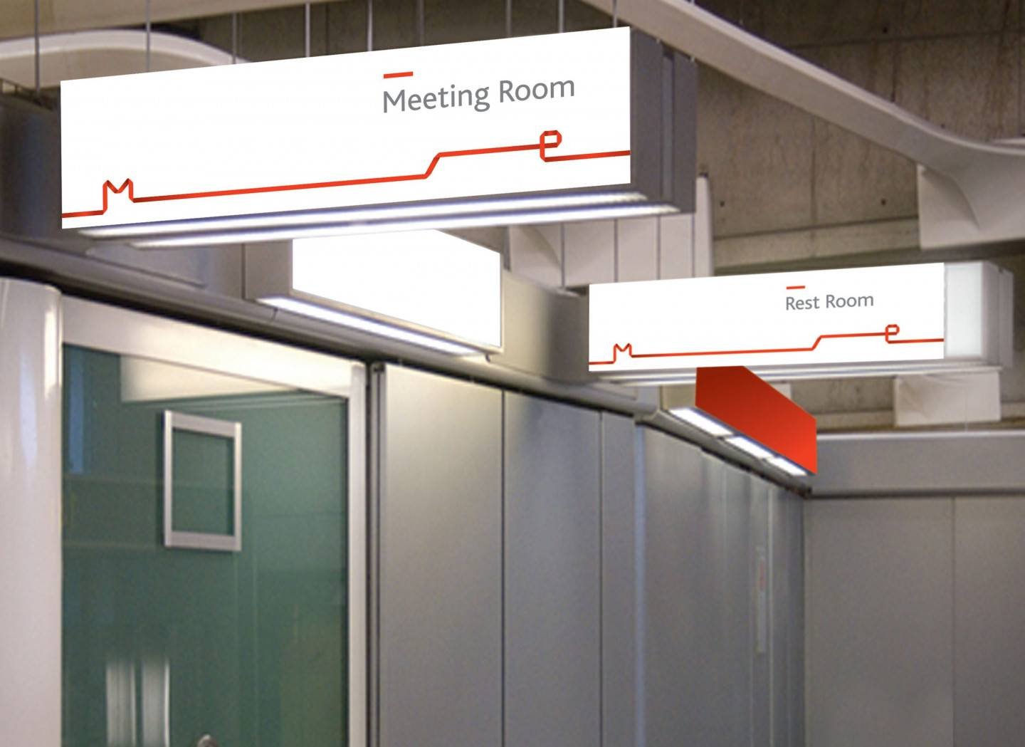
After careful deliberation, we found inspiration in the infinity symbol, a timeless representation of continuity and unity. The symbol not only resembled the letter ‘M’ in Manappat but also embodied the core values driving the organization.
The strategy was clear: create a brand identity that would convey the sense of endless possibilities, seamless collaboration, and unwavering commitment to growth. The infinity symbol beautifully encapsulated these attributes, symbolizing the Group’s perpetual pursuit of progress.
The Outcome
The outcome of the rebranding effort was nothing short of remarkable. The Manappat Group emerged with a reinforced and dynamic brand image, symbolizing an unyielding drive towards success and unity. The multi- dimensional, vibrant infinity symbol visually communicated ambition, growth, passion, and collaboration. It resonated with employees, partners, and clients alike, projecting a sense of reliability and optimism.
The new brand identity not only provided a cohesive look to all the businesses within the Group but also empowered each subsidiary with a shared vision. Employees felt a stronger sense of belonging, knowing they were part of a tribe of progressive people striving towards a common goal.
Moreover, the rebranding exercise facilitated better communication across the Group’s diverse sectors. It encouraged inter-business cooperation, enabling the sharing of ideas and resources for mutual growth. The Group’s consolidated image strengthened its position in the market, attracting new partnerships and opportunities.
In conclusion, the Manappat Group’s rebranding exercise successfully united its businesses under one powerful brand identity. The infinity symbol became synonymous with the Group’s relentless pursuit of progress and served as a constant reminder of its core values.