- Branding, Design
TIGER TIGER FOREST CAFÉ
The Challenge
Most highway cafés are built for speed.
People stop for a quick tea, stretch for a few minutes, and leave without remembering the place.
Tiger Tiger Forest Café wanted to feel different.
The challenge was to create a roadside café brand that felt calm, refreshing, and emotionally memorable while still being practical for travellers on the move. It needed to stand out in a cluttered highway environment without becoming loud or overwhelming.
The identity also had to work across multiple touchpoints—from signage and packaging to food trucks and takeaway experiences—while maintaining a consistent feeling throughout.
The Strategy
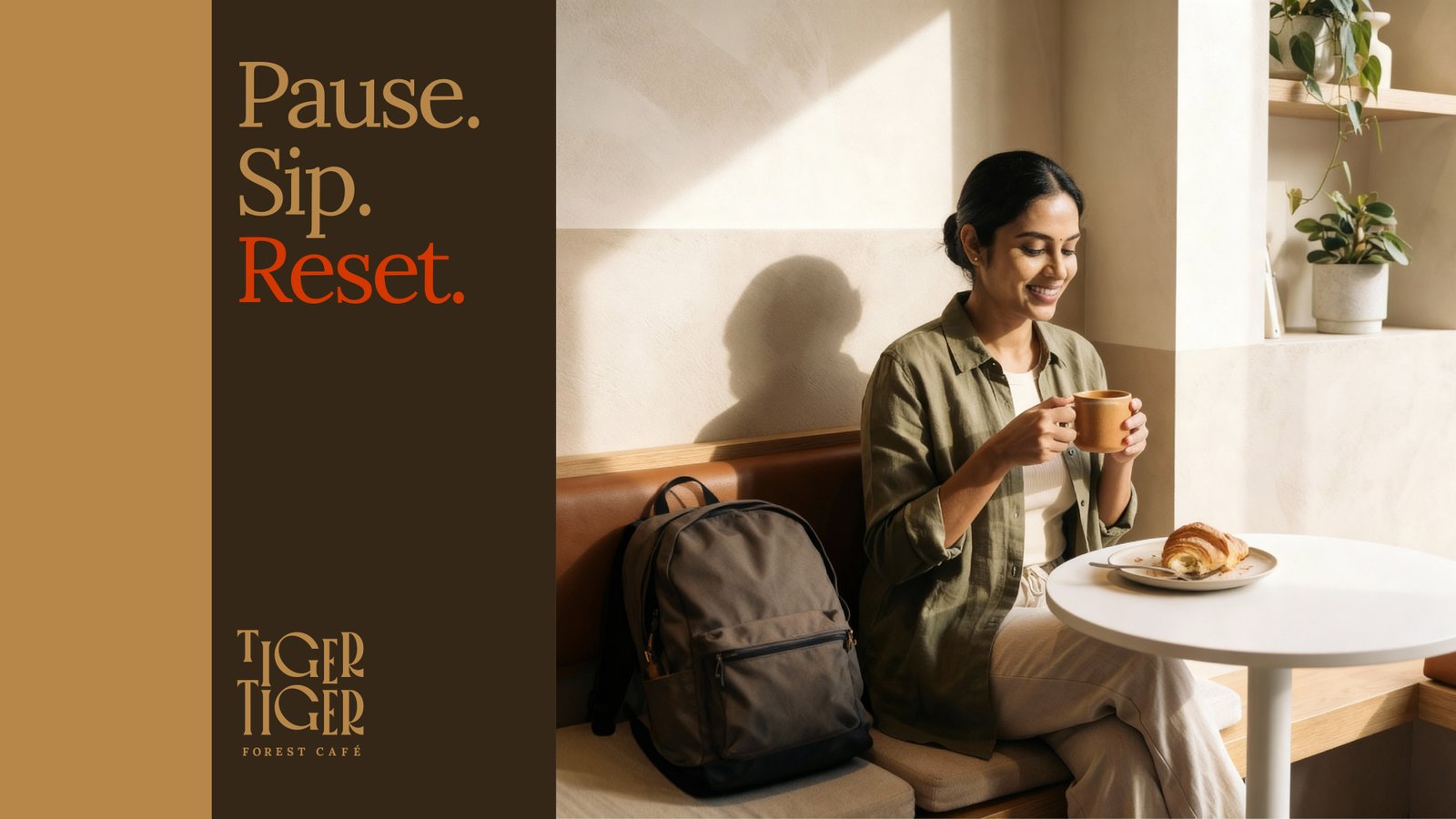
Instead of positioning the café as just another food stop, the brand was shaped around the idea of a pause.
A quiet break between long stretches of road.
The strategy focused on creating a sensory and emotional experience that felt connected to the forest. Every element of the brand was designed to slow people down visually and emotionally.
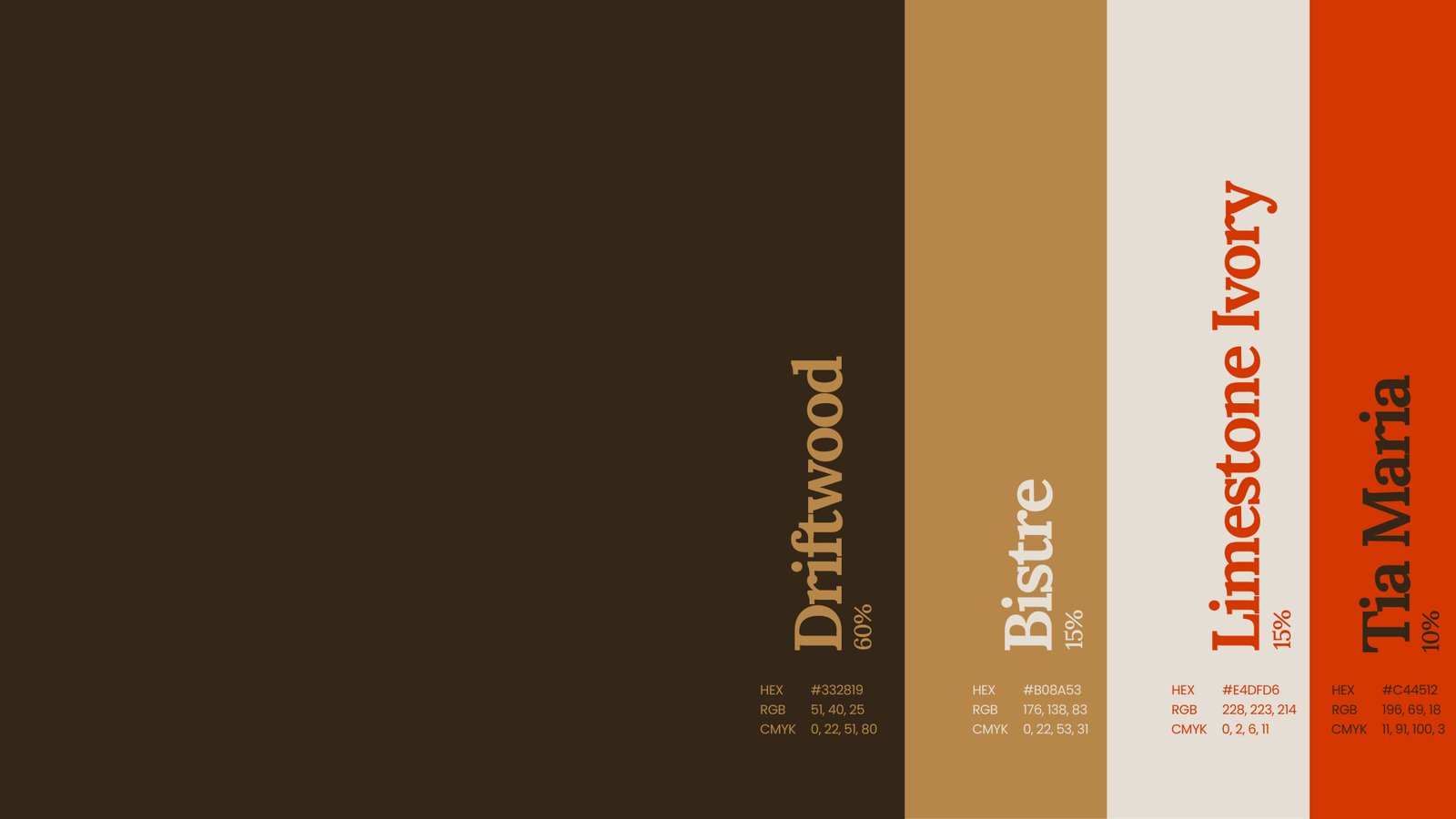
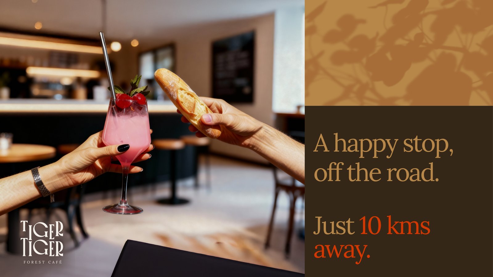
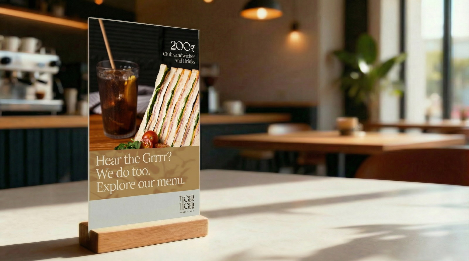
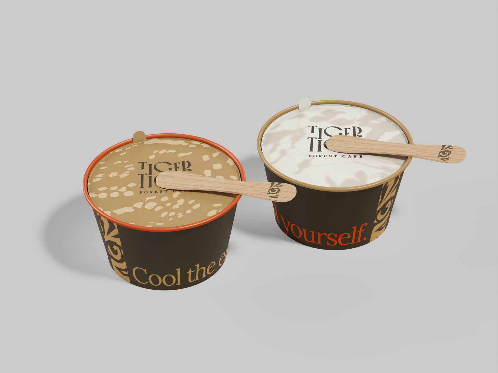
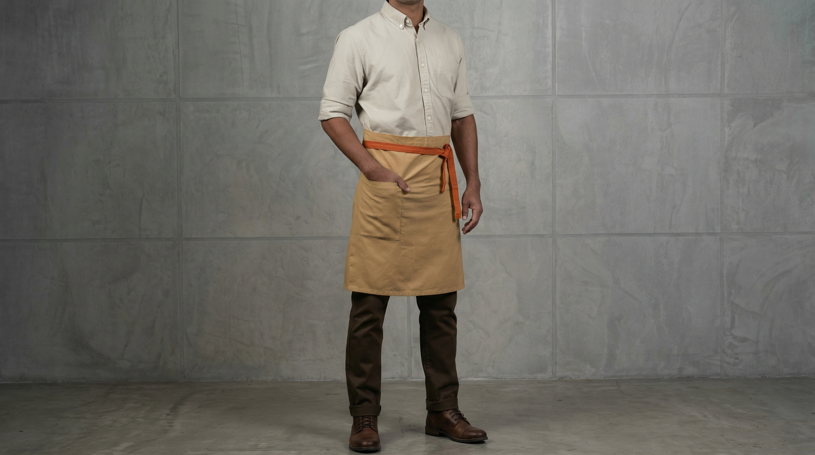
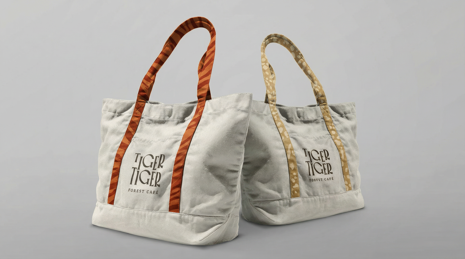
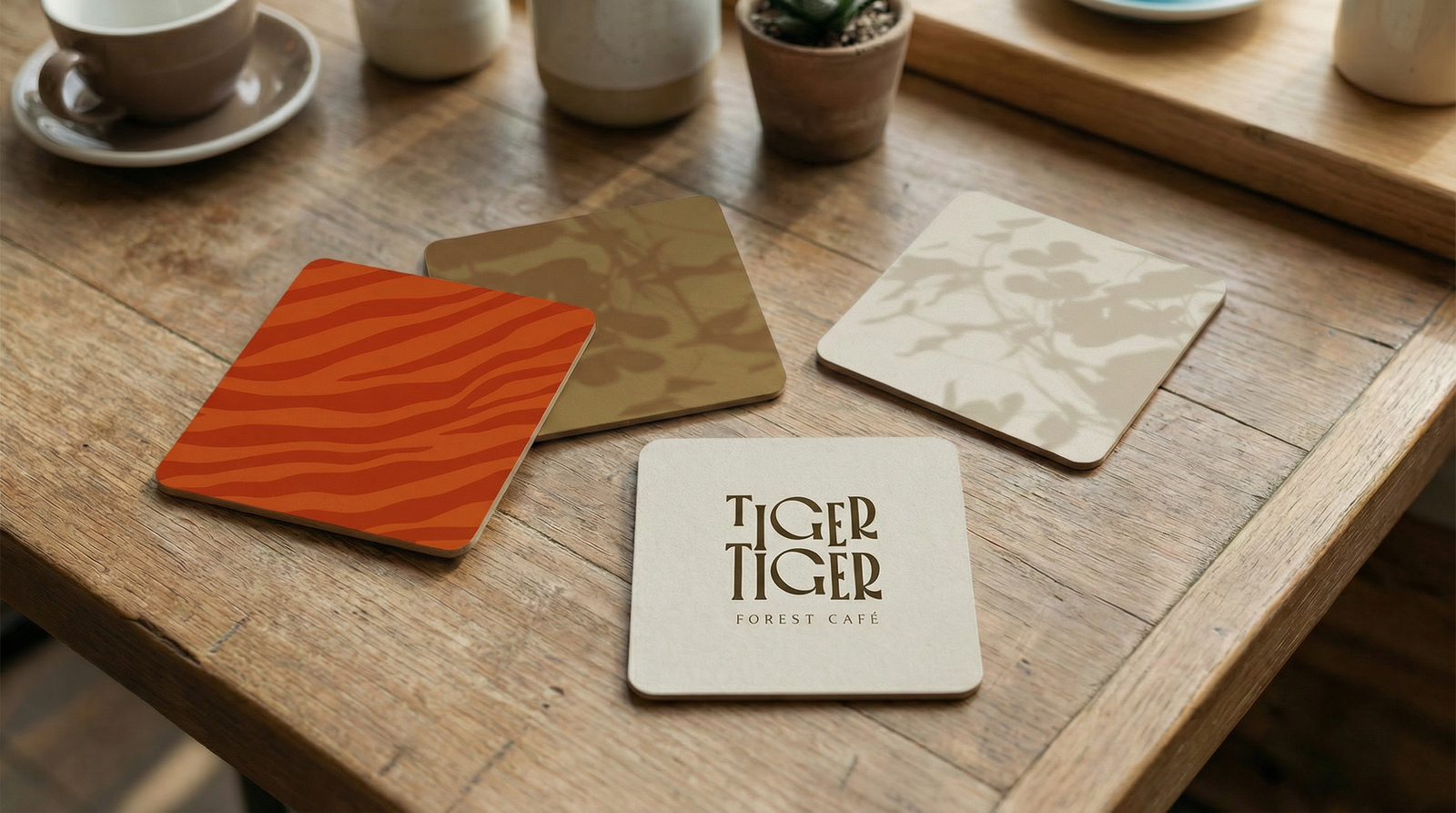
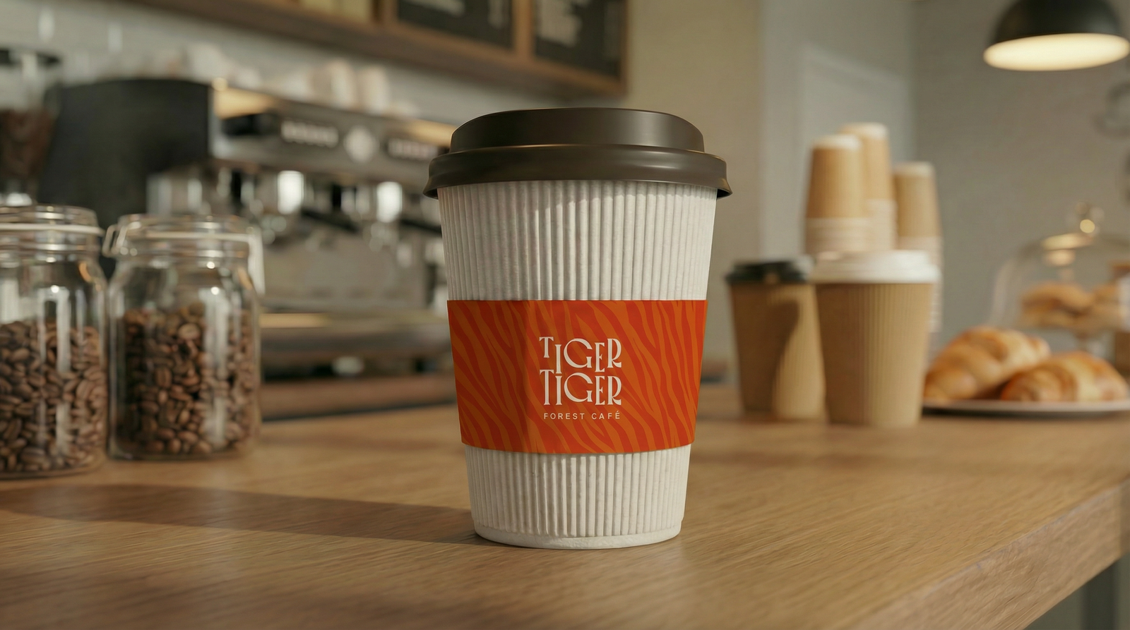
The visual language borrowed from nature in subtle ways through earthy colours, tiger-inspired patterns, leaf shadows, and warm lighting tones.
The communication style was kept short, warm, and human, like gentle thoughts travellers might need to hear during a tiring journey.
Tags:
- Brand strategy, Design, Package design,



The Idea
“Magic off the road.”
This became the heart of the brand.
The idea was to turn an ordinary roadside stop into a small moment of reset.
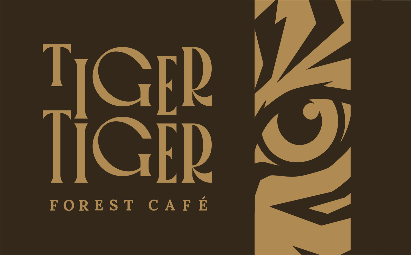
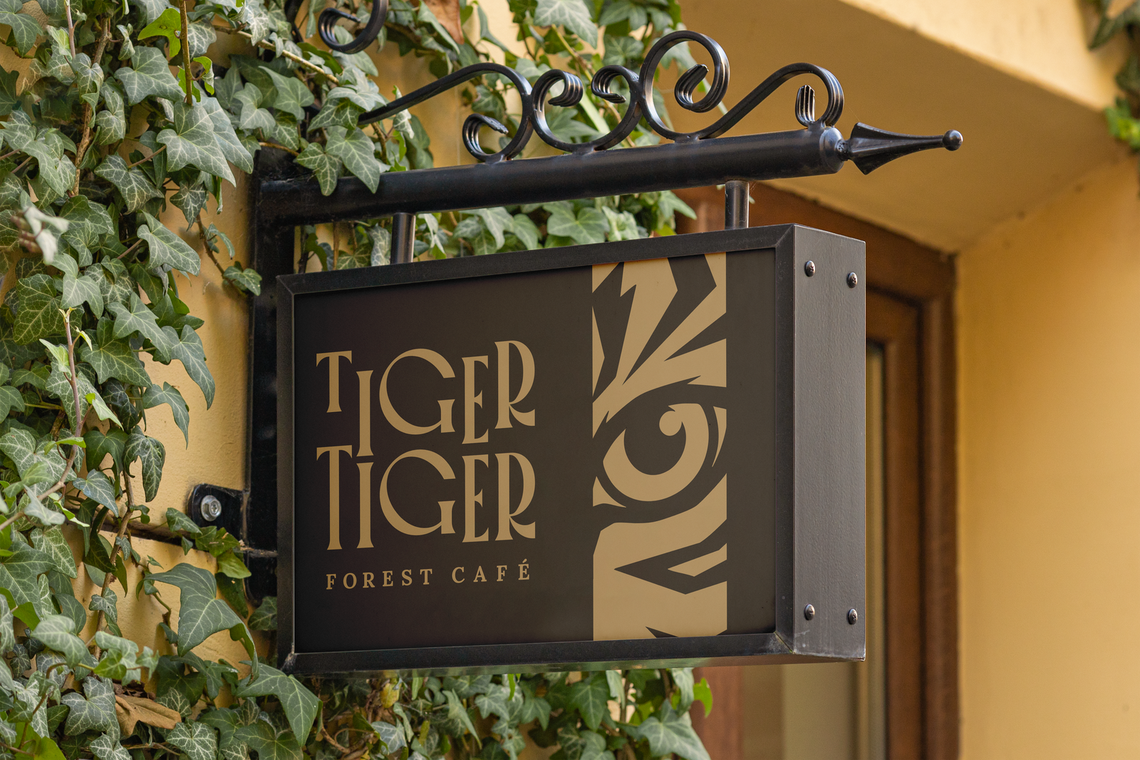
The identity took inspiration from the quiet presence of a tiger in the forest. Instead of showing aggression or dominance, the tiger was interpreted as calm, observant, and grounded. 
This thinking shaped the logo, visual patterns, packaging system, and messaging.
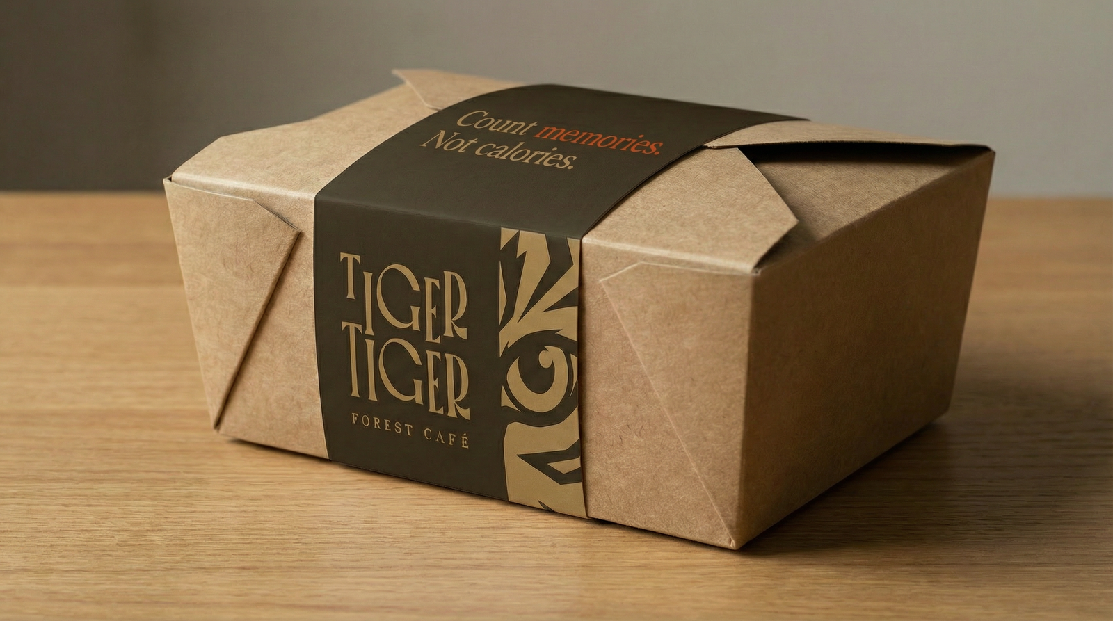
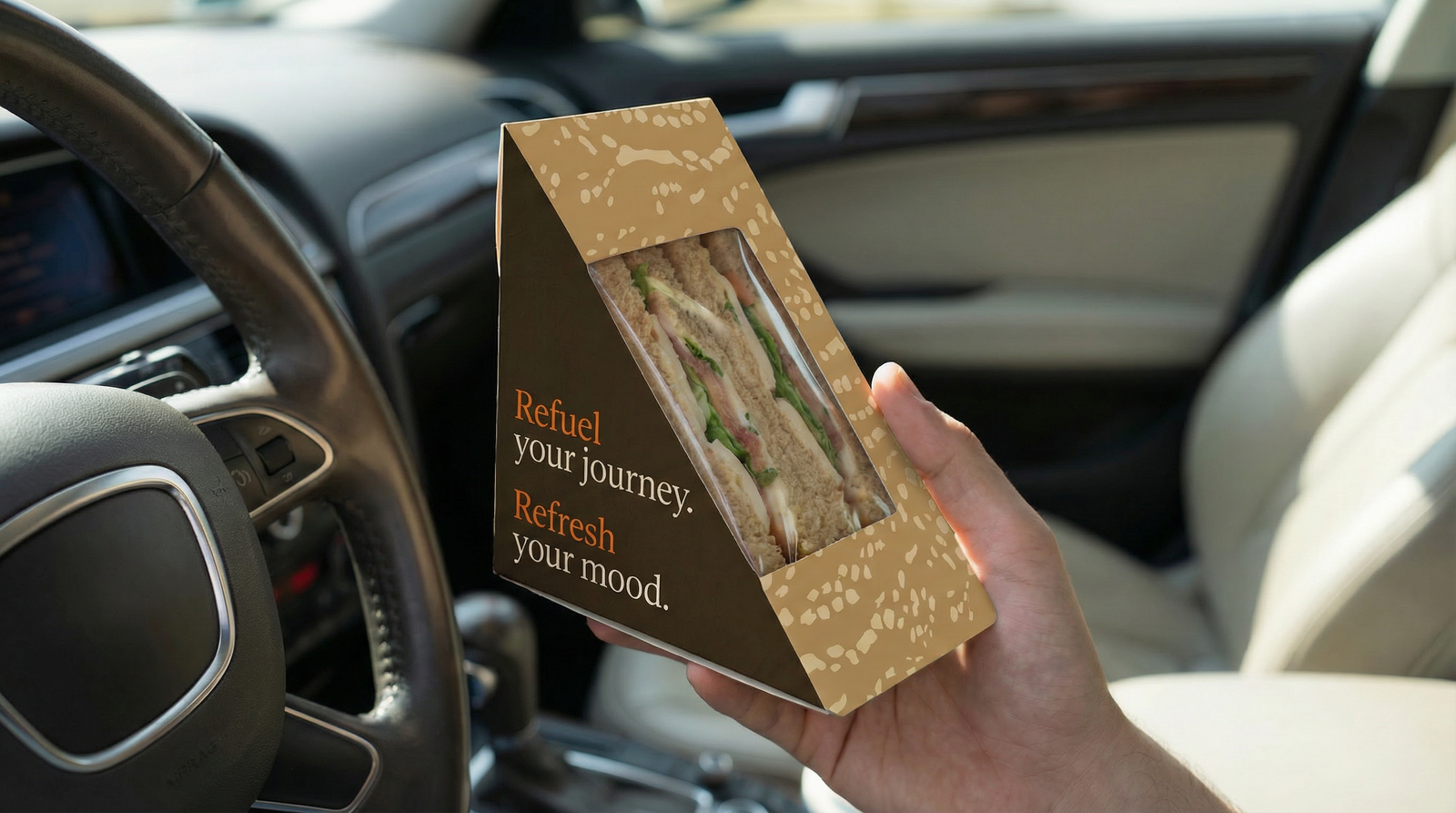
Everything from the muted earthy palette to the soft imagery and tactile packaging was designed to make travellers feel relaxed, refreshed, and ready to continue their journey.



The Outcome
Tiger Tiger Forest Café became more than a café identity.
It evolved into a complete roadside experience system that could live consistently across physical spaces, packaging, communication, and branded applications.
The branding feels warm, memorable, and distinct without relying on loud visuals or exaggerated storytelling.
Whether it appears on a billboard, a takeaway bag, a coffee cup, or a roadside food truck, the identity consistently carries the same feeling: a calm pause off the road.
The result is a brand that travellers do not just stop at, but remember.